 |
| Sand Dunes and Eucalyptus 6" x 6" oil on panel |
Tuesday, November 7, 2017

Thursday, September 28, 2017
Finished Commission Painting
 |
| "Cornflower Field" 30" x 40" oil ~ on the easel |
Now to sign it and let the paint rest and dry.
Tuesday, September 26, 2017
Day 4 work on my commission
 I had a great time in Monterey this past weekend visiting artist's studios in the Monterey County Open Studio Tour. Some very good artists and fun to see their studios.
I really enjoyed Annette Corcoran's studio. She creates some of the most spectacular porcelain tea pots. She is 87 years old and quite a lady. She has been doing these ceramic pieces for 30 years and has many of her pieces in museums. I recommend looking her up on the internet!
Today I had time to work on my commission painting again. Made lots of changes and I am very happy with them. New sky, pushed the distant mountains back some, reworked some of the trees, and worked a little more here and there. Tomorrow I will be working on the foreground and the trees on the right and perhaps a few more changes.
Keep checking my blog to see how it is coming along!
Wednesday, September 20, 2017
Angel Trumpets Painting
My painting "Angle Trumpets" is now up for auction on Daily Paintworks.
You can bid on it here:
http://www.dailypaintworks.com/buy/auction/753140
These are the most beautiful flowers! I love the way the light hits and shines through the flowers!
You can bid on it here:
http://www.dailypaintworks.com/buy/auction/753140
 |
| Angel Trumpets oil 12" x 9" |
These are the most beautiful flowers! I love the way the light hits and shines through the flowers!
Thursday, September 14, 2017
Day 3 Working on the Commission Painting
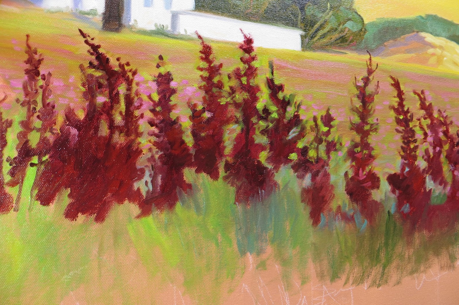
More work on this beautiful landscape scene. I got so involved in the painting that I forgot to take progress photos! But here is the mostly finished painting after adding the pine tree limbs on the right, more grass and of course the purple coneflowers as well as tweaking a few more spots here and there.
 |
| Coneflower Field with Sheep Sorrel - oil - 30" x 40" |
Tuesday, September 12, 2017
Day 2 Working on the Commission Painting
 |
| Day 2 work on the painting |
Yes, I found out what that purple brown weed is called. I did some internet searches and discovered it is a perennial and a common weed of crops, pastures and roadsides. I remember seeing lots of it as I was growing up. It is a native to Asia and Europe, but has spread to North and South America as well as Australia and Africa. The plant is green at first then becomes reddish brown as the fruit matures. There are a number of varieties of this plant with many different names for it


including Sheep Sorrel, Sour Grass, Field Sorrel, Red Sorrel and Dock. I am not sure, but I think the Sorrel in my painting is Sheep Sorrel. Some people make a tea from its leaves, but I read that it can be mildly toxic, so I would not recommend it. I love it as it makes such a pretty contrast to the greens and yellows.
 |
| The view today. Notice the Sorrel under the trees. |
As I drove to Monterey last weekend, I kept looking for the Sorrel along the road sides. I was disappointed by how little I saw, but I think I found the place where I took my original photo many years ago. It doesn't look the same anymore. The beautiful purple coneflower field is now a grape vineyard and there are new trees blocking the view of the hills.
So with my piece of sorrel I broke off on the site, I worked on my painting today. Below are a few photos of the painting progress.
 |
| Working on the field behind the sorrel. |
 |
| Softened the hills and worked on the sorrel and grasses. |
 |
| Detail |
 |
| Working on the foreground as well as the background buildings. |
 |
| More detail work on foreground grasses and side trees. So after a good six hours of work, I decided to give my painting arm a rest. I will hit it again tomorrow and add some coneflowers, more grasses and work on the trees to the right. Getting close to half done. |
Wednesday, September 6, 2017
Day 1 Painting on the Commission Painting
FIRST STAGES OF UNDER PAINTING
Well today was the first day in awhile that it was cool enough to get into my studio comfortably. So I headed out there to get started on my large commission painting. Many artists layout the design using black charcoal, but I have found that to be a mess. The black blends in with the paint and sometimes changes the color, so I decided to try my new white charcoal pencil. I was very pleased with the results. After grafting off the canvas into rectangles, I was able to draw out the design composition.
My client said she likes grain towers, so I decided it would be fun to add two to the painting and make some compositional changes to lead the eye into the background better.
When I was satisfied with the composition, I began by painting in the darkest values with ultramarine blue, sap green and a tad alizarin red. To balance the darks I added some of the lightest lights in the buildings.
I wasn't sure how to capture those tall, deep purple weeds and what colors to mix to get that color, but I discovered in my stash of paint a tube of Madder Brown. It is perfect! Wish I knew what those weeds are called. I love seeing them in the landscape. If you know what they are called, let me know, OK?
Well I got carried away painting and forgot to take more photos as I was working. The sky and rolling hills captured my attention for a long time. So here is my 1st day on the job and getting the under-painting worked out. That foreground is going to be a challenge, but fun to tackle in the coming days. Come back often and see the progress.... !

ALL WORK ON THIS WEBSITE IS COPYRIGHTED.
 |
| First Day's Work |
Well today was the first day in awhile that it was cool enough to get into my studio comfortably. So I headed out there to get started on my large commission painting. Many artists layout the design using black charcoal, but I have found that to be a mess. The black blends in with the paint and sometimes changes the color, so I decided to try my new white charcoal pencil. I was very pleased with the results. After grafting off the canvas into rectangles, I was able to draw out the design composition.
 |
| Drawing the Composition in White Charcoal Pencil |
My client said she likes grain towers, so I decided it would be fun to add two to the painting and make some compositional changes to lead the eye into the background better.
 |
| Drawing in the house |
 |
| Adding some of the dark values |
When I was satisfied with the composition, I began by painting in the darkest values with ultramarine blue, sap green and a tad alizarin red. To balance the darks I added some of the lightest lights in the buildings.
 |
| Adding some light values |
I wasn't sure how to capture those tall, deep purple weeds and what colors to mix to get that color, but I discovered in my stash of paint a tube of Madder Brown. It is perfect! Wish I knew what those weeds are called. I love seeing them in the landscape. If you know what they are called, let me know, OK?
Well I got carried away painting and forgot to take more photos as I was working. The sky and rolling hills captured my attention for a long time. So here is my 1st day on the job and getting the under-painting worked out. That foreground is going to be a challenge, but fun to tackle in the coming days. Come back often and see the progress.... !

 |
| Close up of the house & trees |
ALL WORK ON THIS WEBSITE IS COPYRIGHTED.
NO COPYING IS ALLOWED WITHOUT THE WRITTEN PERMISSION OF THE ARTIST.
THANK YOU.
Every monitor is different according to your settings.
The actual painting may look different from your computer monitor.
The actual painting may look different from your computer monitor.
Monday, September 4, 2017
Art Show in Pacific Grove
AUGUST 28 - OCTOBER 27 - 2017
 |
| They even installed new track lighting for me! |
RECEPTION - SEPT. 8th 5 - 7 pm
Please join me and the three other artists in this show, Harry Wareham, Laura Lockett, and Tamara Keiper, for our reception on Sept. 8th, 5 - 7 pm.
Come and enjoy live music and refreshments.
10% of all sales donated to the Sally Griffin Center to help Meals on Wheels. In conjunction with the Central Coast Art Association.
 |
| Three pastels. |
 |
| A painted lady in Pacific Grove. This pretty house is near the park in Pacific Grove. |
Sunday, September 3, 2017
Preparing the Canvas for a Commission Painting
 |
| Look how much bigger the 30" x 40" canvas is compared to the small 8" x 10" study! |
Here are photos of the clay pot color which I toned the canvas. I used gesso tinted with acrylics. I brushed it on with a wide brush then wiped it smooth with an old credit card to even out the brush strokes. This seemed to work well and I think it will be a good background for the painting.
 |
| Brushing on the new tinted gesso. |
 |
| Half way there. |
 |
| All ready to get started... when my studio is cool enough that is. |
Friday, September 1, 2017
Preparing to Do a Large Commission
I am so blessed to be doing a large 30" x 40" commission painting. My client wants a copy of a pastel scene I did many years ago. It is one of my favorite scenes I worked from a photo I took on the way home from Monterey. I was driving near Casa de Fruita when I noticed a field of beautiful purple corn flowers, dark purple tall weeds, trees, houses and the golden, rolling foothills. The scene captured my heart. I have passed by this same spot many times since, but never found those flowers again.
To get ready to paint the large painting, I have been working on some small oil studies. One in black & white to study the values and a second smaller 8" x 10" painting, also in oil, to work out any problems I may encounter. I toned the small canvas with an orangey background color to see if that would work, and I like it.
You can see the steps I made along the way in the 8x10, although, I was so engrossed in the painting that I forgot to take more photos. I am so looking forward to getting started on the large canvas. Come back to this blog as I will be posting my progress... if I remember to take photos!
Come back later to see work progressing on the large painting.
 |
| Small oil studies |
You can see the steps I made along the way in the 8x10, although, I was so engrossed in the painting that I forgot to take more photos. I am so looking forward to getting started on the large canvas. Come back to this blog as I will be posting my progress... if I remember to take photos!
 |
| Blocking in the dark and light values |
 |
| Adding buildings and background grasses |
 |
| A peek at my palette |
 |
| Moving right along |
 |
| Working on the foreground |
 |
| Adding some of the cornflowers and pine tree on the right |
Come back later to see work progressing on the large painting.
All work copyrighted.
Visit my website: www.RhettsStudio.com
and my Daily Paintworks Gallery
Friday, July 21, 2017
New Halloween Paintings
 |
| Pumpkin Guards 16" x 12" acrylics |
I am trying something new. I never thought I was very good using my imagination, but I am so excited about this new painting process for me. It is called "Intuitive Painting". It is begun with putting lots of globs of acrylic paint on the canvas and mixing them all about with scrapers, brushes, sticks, sponges, etc. Let that layer dry (or not) and add stamps, stencils, more brush strokes, etc. Let that layer dry again. The idea is to play with the paint and not worry about anything, just trust yourself that it will be alright whatever you do!
The next layers seem to paint themselves. I had an idea what I wanted in the paintings... crows and a halloween theme... and somehow the images just popped into view as I started blocking in the various images and painting over parts of the background. My mind just flowed with the paint. I painted over many of the background layers, but some stayed and more layers of stamps & stencils and brush strokes appeared too.
It was an amazing experience creating these paintings. I hope to do more like these in the future! Let me know what you think of them!
 |
| In the Pale Moonlight 16" x 12" acrylics |
I wanted to keep the Halloween theme light and fun, not gruesome and bloody. There are children who visit the gallery and the paintings need to be fun.
 |
| Spirit Dance 16" x 12" acrylics |
 |
| Candy Thief 16" x 12" acrylics |
See my paintings at the Tracy Grand Art Gallery, Tracy, California
September and October, 2017
Thursday, May 11, 2017
Painting the Town with Red Party Shoes!
 |
| Party Shoes 8" x 8" on deep cradled ampersand board |
Now these are shoes I have always dreamed of wearing! So pretty with the open toe. They were made of silk-like material with a silver lining. And oh such a high heel! My feet ached just looking at them. But some gal wore them. They probably hurt her feet so badly that she gave them up to the thrift shop! I wonder what she was like, the girl who wore these shoes. What story she might tell of her adventures in these shoes!
 |
| Value Studies in pencil |
 |
| Photos of the shoes in my light box. |
 |
| First stage in the painting process |
I toned my board with red, wiping off most of it. This was just to give a little color to the background and to cut down the white glare.
I next drew the shoes with burnt umber to get their shapes right. Then the real painting began. I started with the bright red. I found red is a difficult color to work with. If you want a light area, you can't add just white as it turns the red pink! So I had to darken the areas around the bright red to make them show off.
Below are my finished paintings.
 |
| Red Shoes 6" x 6" on cradled ampersand gessobord |
 |
| After the Party 6" x 6" oil on cradled ampersand gessobord. |
Wednesday, May 3, 2017
Baby Mourning Doves Mixed Media
 |
| Baby Mourning Doves |
Well, I guess I will just called it a Mixed Media piece. My reference photo is below. These mourning doves find our carport perfect for their nests. This is the 2nd brood this year! Momma is very watchful of her babies.
 |
| My photo reference from my own photo. |
 |
| Here is my oil painting from the mixed media project below. |
Monday, May 1, 2017
Drawing a Mourning Dove using acrylic inks and pan pastels
A MIXED MEDIA PROJECT
 This has been an interesting project for me. I am trying some new techniques and using some new materials I have never used before. I am still struggling learning to accurately draw birds. They are more difficult than one would believe. I bought an online class on Craftsy on drawing birds. The teacher is a very fine bird illustrator and he had us using acrylic inks in many layers. This creates a beautiful, stained glass-like affect. Wonderful! We have Mourning Doves nesting in our carport every year. Last year there were 5 broods of nestlings! They are so cute to watch as their parents care for them. Mourning Doves are so sweet. I just love them and thought I would try my hand at this bird.
Before we began we made a value drawing and graphed it out to transfer to our final paper. I learned that I really did not observe the bird very well. John Muir Laws says he often makes the head too big and yep, so did I. Amazing how you learn from your mistakes. I also wanted to slim down the bird a little as I thought she was too fat and puffy. This was probably another mistake. I should have followed the photo more closely.
 |
| Photo by Pandeeswaran Bhoopathy Thank you to Pandeeswaran for letting me use your photograph. He is an amazing photographer! |
 |
| Here is my value pencil drawing from my source. |
 |
| I made a photo copy of my drawing and then graphed it out to transfer to my mixed media paper. |
 |
| This is the beginning stages of inking my drawing. I used very thin, pale ink. |
 |
| The final stages of inking. |
 |
| I decided to add a branch under my bird, but the source photo did not show me the feet. This made it very difficult. I am not very good at drawing feet without a source. So I searched and searched for a photo that might show me a Mourning Dove in this position where I could see the feet. But I did not have much luck, but I finally figured out what to do which you can see in the final photo. |
 |
| I was not really very happy with my results. I felt the bird looked like a pine cone (a quote from John Muir Laws) because I had drawn every feather! A big no no. So what could I do? Well I decided to go over my drawing with pan pastels. They are amazing pastels. I have worked with stick pastels for years, but these new pastels are amazing. They are very transparent and can be put over the inks making a softer look. Doves have a softness to the feathers and the pan pastels really made the dove look nicer and smoother. I loved it! |
 |
| I wanted to add a soft background, so I decided to try my hand at using the pan pastels. Here is my effort as I was progressing with this. The pan pastels are so soft and create a fuzzy, soft background. |
|
| So here is my mostly finished project. For a first project using this technique, I am satisfied, but feel I have much more to learn. But that is a journey I am willing to work toward improving. And I had fun doing it! |
RESOURCES:
John is an excellent teacher and has some great bird (and animal) drawing lessons on line. Check his website out.
Drawing Birds in Brush & Ink with George Boorujy
George is a very fine bird illustrator and this is an excellent class.
Subscribe to:
Posts (Atom)